
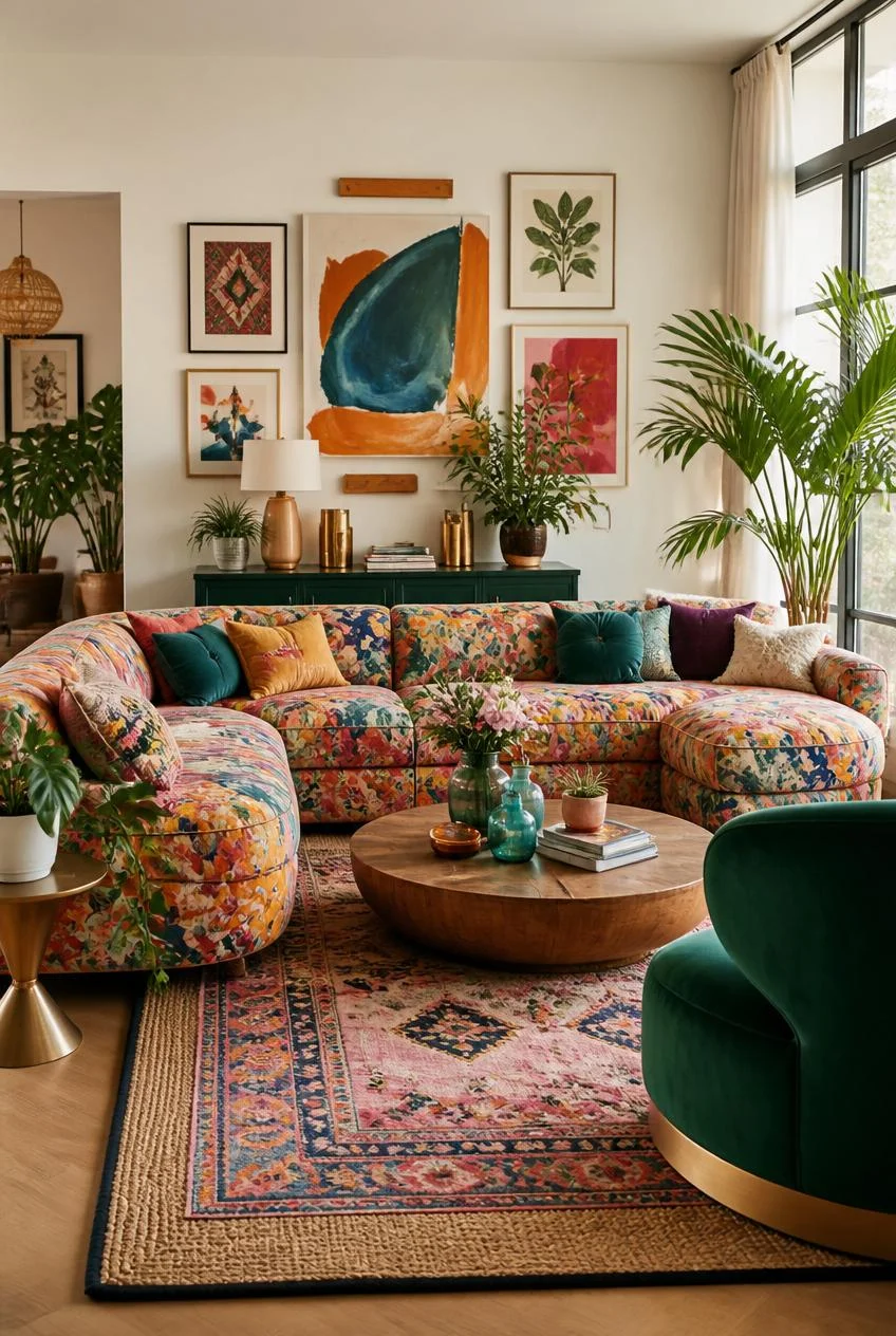
14 Colorful Living Room Ideas That Will Make You Rethink Everything About Color
For years, the safe choice in living room design has been beige, gray, or some quiet shade in between. Walls stayed neutral, furniture stayed muted, and the only burst of personality came from a single throw pillow labeled as an accent. But the living rooms people remember, the ones that feel warm and alive the moment you walk in, are almost never the cautious ones. They are the ones where color was treated as a decision, not an afterthought.
Colorful living room ideas are not about throwing every shade at the wall and hoping it works. They are about understanding how hues relate to one another, how texture changes the way a color reads, and where the eye needs a moment of rest. When those principles come together, even the boldest combinations feel calm, intentional, and deeply personal.
This list walks through 14 colorful living room ideas that prove bold does not mean chaotic. Each one focuses on a different way to bring color into a space, with practical tips so you can borrow the parts that fit your own home, whatever your style or budget happens to be.
A Painted Ceiling That Changes the Whole Room
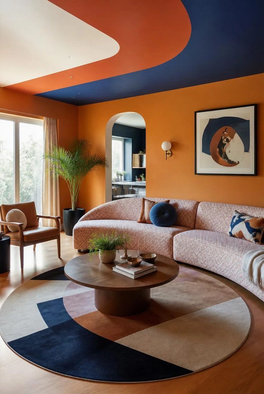
Most people never look up when planning a living room, which is exactly why a painted ceiling has such an impact. A ceiling treated as a canvas, whether in two interlocking colors or a single bold hue, takes pressure off every other surface in the room. Walls can stay warm and simple, and furniture can lean into pattern without anything feeling overcrowded, because the visual drama is already happening overhead.
If a full color ceiling feels like too much at once, start with a single recessed section or a smaller drop ceiling area painted in one contrasting tone. Pair it with warm wall colors like ochre, terracotta, or burnt sienna, and let furniture carry pattern freely underneath. A simple wooden coffee table with natural grain gives the eye somewhere calm to land without dulling the energy above.
Why It Works
A colorful ceiling shifts the entire visual hierarchy of a room. Instead of furniture and walls competing for attention, the ceiling becomes the anchor, freeing everything else to feel more relaxed and cohesive.
A Warm Sofa Color as the Starting Point
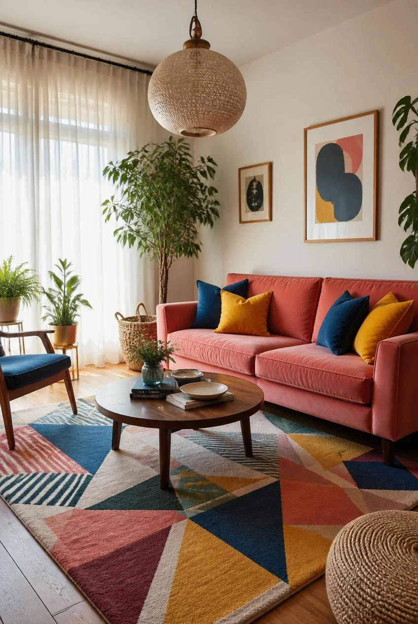
Choosing a sofa in a warm, saturated shade such as salmon, peach, or coral gives a room an immediate emotional core. Everything else can be built outward from that single piece, using cushions in contrasting colors like cobalt blue or sunshine yellow that sit on top of the sofa rather than blending into it.
That contrast matters. A colorful living room is not the same as a pastel one, and the difference often comes down to how boldly accent colors stand apart from the base. A patterned rug in multiple tones, a textured pendant light overhead, and sheer curtains that let in natural light all work together to keep a warm-toned room feeling bright rather than heavy.
Styling Tip
Sheer curtains are one of the most underrated tools in a colorful living room. They flood the space with diffused light, which keeps saturated colors looking fresh instead of muddy, and they give the eye a soft, neutral place to pause.
Complementary Colors That Actually Work Together
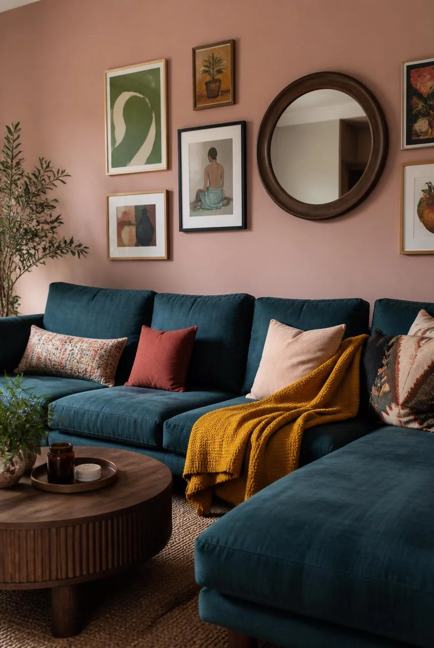
Pairing a deep, cool color like teal with a warm, soft tone like blush pink might sound like a clash on paper, but in practice it often becomes one of the most balanced combinations in interior design. The key is temperature contrast. A cool jewel toned sofa against a warm pink wall grounds the space without flattening either color.
Adding a third tone, such as a mustard throw used casually rather than as a styled accent, completes the palette without overwhelming it. A gallery wall with frames in colors pulled from the room, paired with bright illustrative art, ties the whole composition together. A round mirror in a deep wood tone acts as a quiet anchor that keeps the eye from drifting too far in any direction.
Color Pairing Insight
Complementary does not always mean matching intensity. The most successful pairings often involve one bold color and one slightly softer version of its opposite, which creates harmony instead of competition.
Letting Art Lead the Color Story
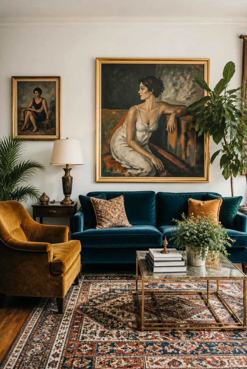
Sometimes the boldest color decision in a room is not paint or furniture at all, but art. A series of large scale paintings in bold, graphic color can completely transform an otherwise neutral space, giving it personality without requiring every other element to be loud as well.
When art carries the color story, furniture can stay relatively grounded, think teal velvet, mustard accents, and a vintage style rug, while the walls themselves remain a soft neutral. Large indoor plants add a living, slightly unpredictable element that softens the structure of the room, and one unexpected accent color, like an orange lamp base, becomes an exclamation point rather than a distraction.
Practical Insight
For this approach to feel intentional rather than random, choose art with a consistent visual style across pieces. Mixing photography, abstract work, and illustration in the same space tends to dilute the impact rather than strengthen it.
Deep Walls With Warm Furniture Inside
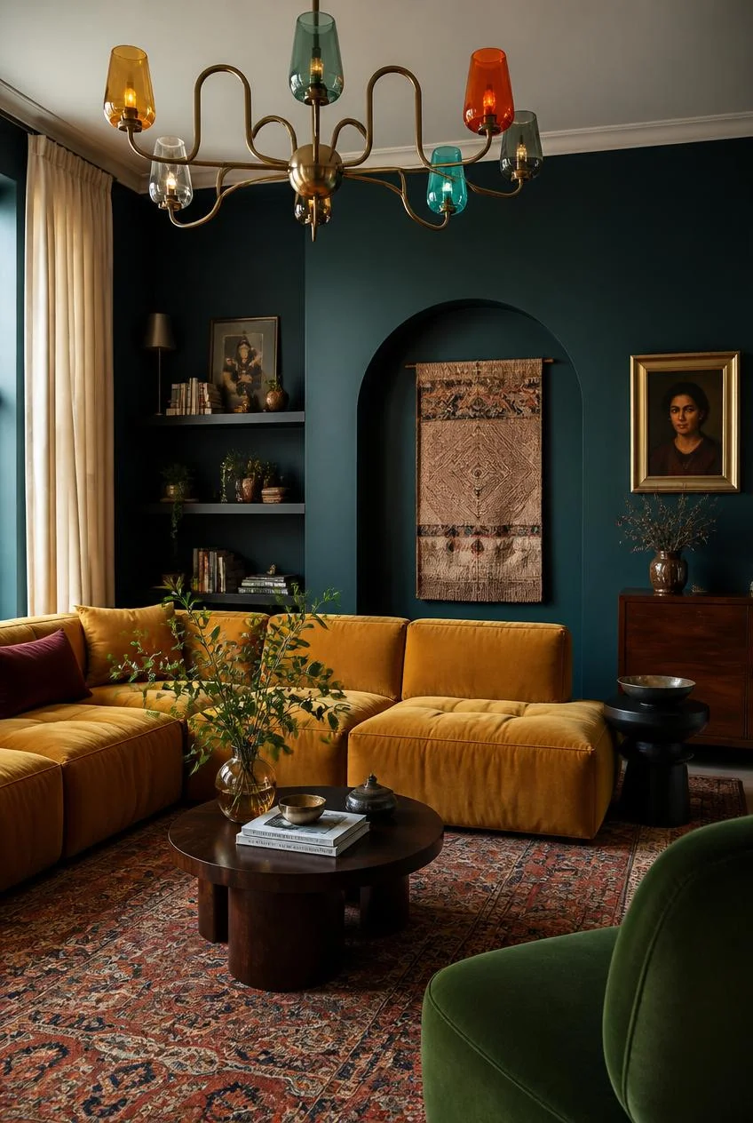
Painting an entire room in a deep, saturated color like teal or forest green is a commitment, but when paired with warm woods, mustard textiles, and a rug in rusted reds, the result feels resolved rather than mismatched. The trick is what design experts often call saturation parity, meaning every element in the room is equally rich and equally confident, so nothing looks like an afterthought.
A statement light fixture, such as a multi colored chandelier with glass shades in different hues, can resolve the tension between cool walls and warm furniture from overhead. An arched niche painted the same deep color as the walls, filled with a woven textile, adds architectural interest without introducing a new color into the mix.
Why Deep Color Works
Dark, saturated wall colors do not always make a room feel smaller. When paired with warm lighting and natural materials, they can make a space feel enveloping and intimate rather than closed in.
Floating Shelves as a Color Display
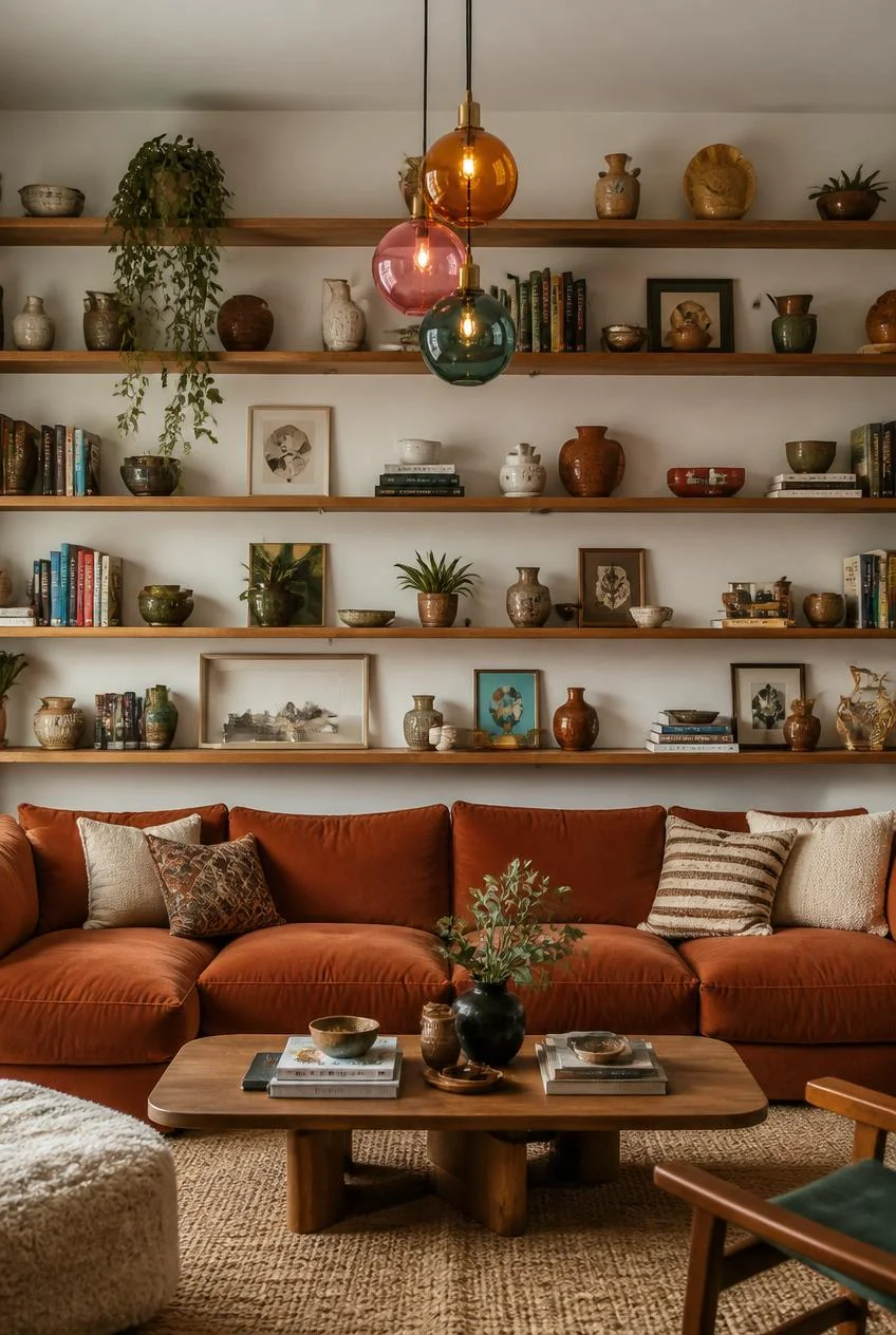
A wall of floating wooden shelves loaded with ceramics, books, plants, and small art pieces is one of the most flexible ways to bring color into a living room without painting anything. The key is density without clutter, which comes from varying the shapes, heights, and materials of the objects displayed.
Pendant lighting with colored glass shades adds another layer of color that activates after dark, since each shade can cast a different colored glow. A rug with a strong textural pattern rather than a busy color scheme helps ground a shelf wall that is already carrying a lot of visual interest.
Styling Approach
Treat shelves like a collection that grows over time rather than a single styling session. The most successful colorful shelf walls usually look like they were assembled gradually, not purchased as a set.
A Cozy Reading Corner With Color and Texture
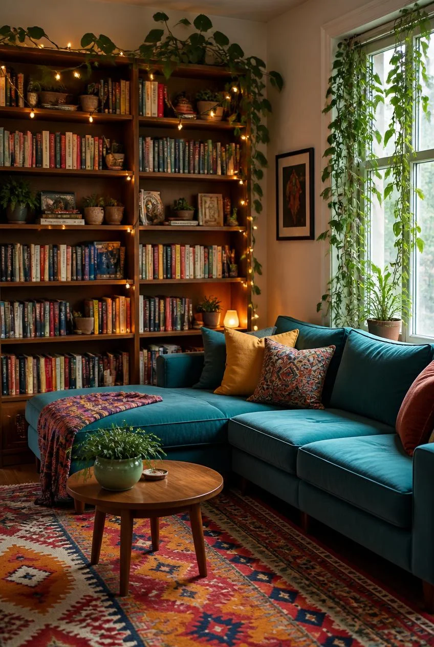
Bookshelves, a comfortable sectional, and warm lighting combine to create one of the most personal kinds of colorful living room spaces. A tall bookcase filled with color spined books, small figurines, and string lights threaded through the shelves adds ambient warmth that overhead lighting alone cannot replicate.
Trailing plants draped over windows or down the sides of shelves soften hard architectural lines and introduce gentle movement into the room. A patterned rug in multiple colors can act as a bridge, connecting a throw on the sofa to a cushion across the room without those colors needing to directly match.
Why It Feels Personal
Small details, like a collected object on a windowsill or a plant that has clearly been growing for years, are what make a colorful room feel like a home rather than a showroom.
White Walls as a Bold Color Background
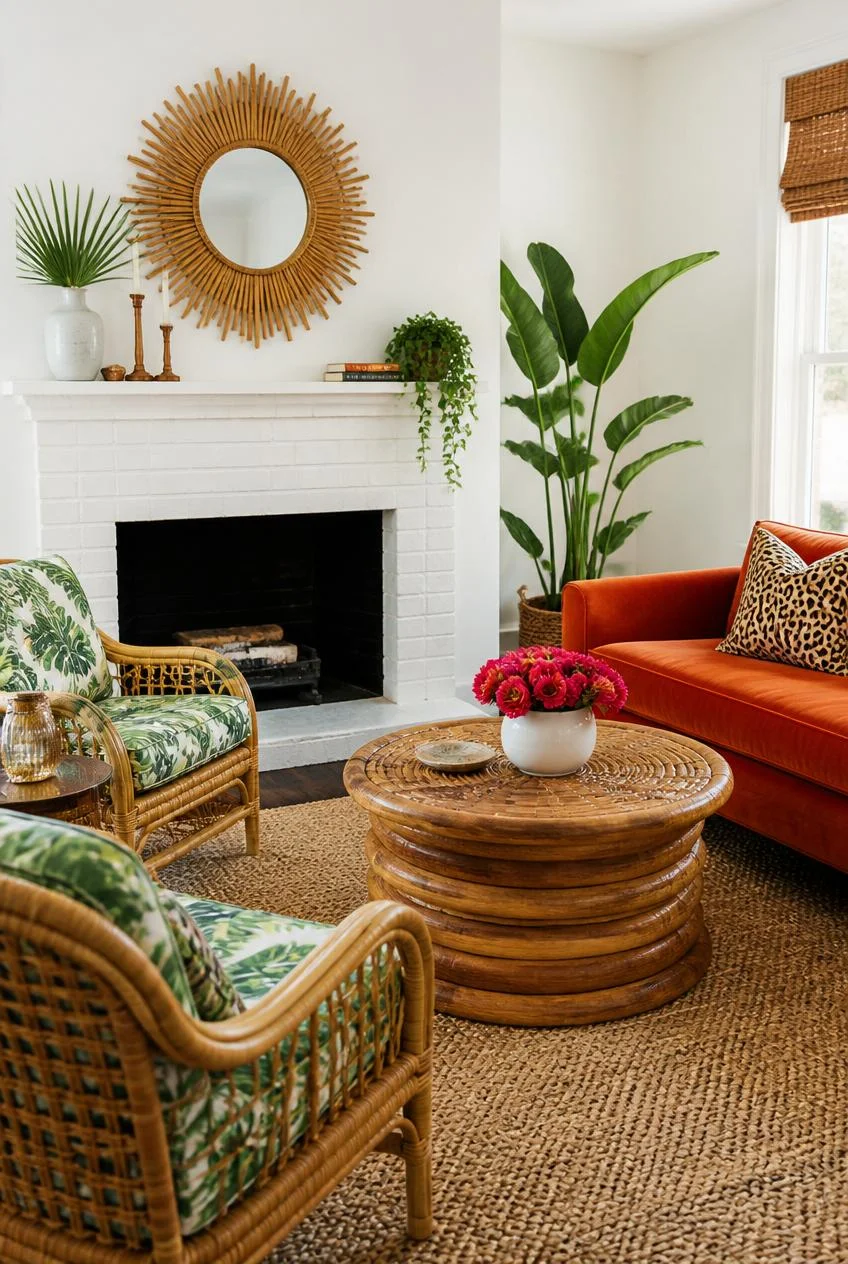
It might seem counterintuitive, but white walls can be one of the best foundations for a colorful living room. White offers maximum contrast, which means every colorful piece placed against it reads at full intensity, with nothing competing for attention on the walls themselves.
Tropical print upholstery on a rattan frame, a bold colored sofa, and a patterned coffee table all stand out clearly against a white backdrop. A sunburst mirror or woven pendant light adds natural texture that softens the overall look without diluting the color.
Layout Tip
Keep wall art frames consistent in material, even if the prints themselves vary in size and color. This small consistency makes a mixed gallery wall feel curated rather than random.
A Statement Sofa Color That Works Year Round
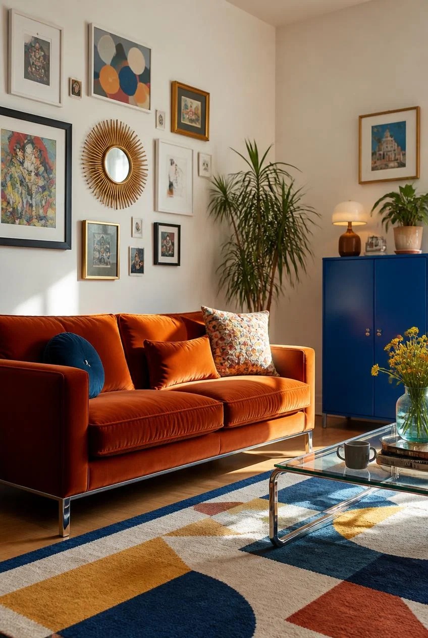
Choosing a sofa in a warm, earthy shade like rust or burnt orange is one of the most durable color decisions you can make, both in terms of style and lighting. These tones tend to look good under warm evening light and cooler daylight alike, which is not true of every saturated color.
A gallery wall with varied print sizes, anchored by a sunburst mirror that also reflects natural light back into the room, adds depth without requiring additional furniture. An unexpected accent piece in a completely different color family, like a cobalt blue cabinet, introduces contrast that keeps the room from feeling like a single uninterrupted mood.
Why Scale Variety Matters
Mixing large and small art pieces on a gallery wall creates rhythm. A flat grid of identically sized frames tends to feel static, while varied scale gives the eye a path to follow.
Layered Lighting for Color That Shifts at Night
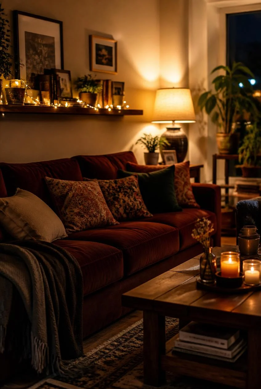
Saturated colors do not stay the same under different lighting, which is why layered lighting is essential in any colorful living room. String lights at mid height, a table lamp for focused tasks, and candles closer to floor level each add a different quality of warmth to the space.
Warm bulbs tend to deepen reds and oranges while making cool tones like teal appear softer and warmer. This means a room can genuinely feel different after dark than it does during the day, which adds another dimension to the overall color experience.
Lighting Insight
Before committing to a bold wall or furniture color, view paint swatches and fabric samples under both natural daylight and the warm artificial light you plan to use in the evening.
Rugs as the Room’s Color Bridge
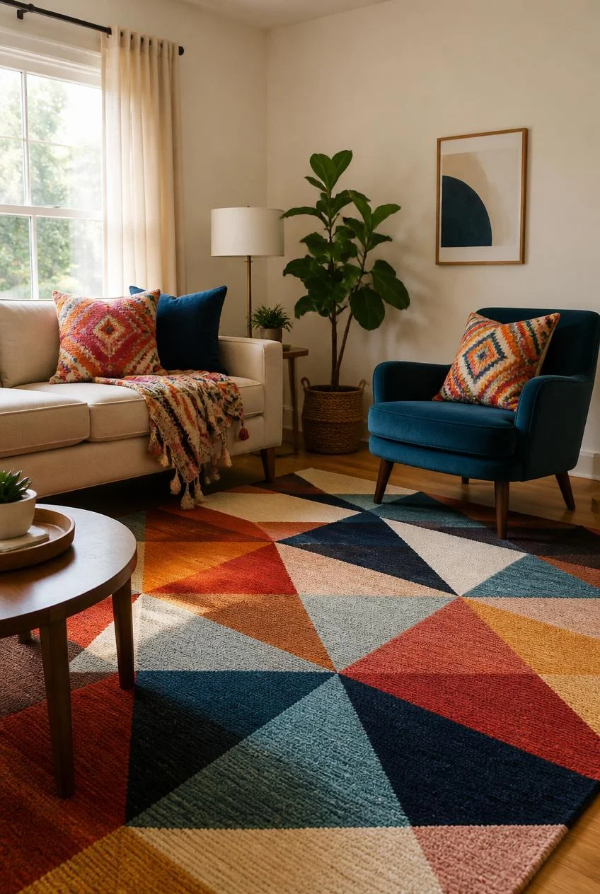
A patterned rug in multiple colors can do more for a colorful living room than almost any single piece of furniture. Rather than functioning purely as a floor covering, a well chosen rug acts as a bridge, linking colors used elsewhere in the room, a cushion here, a throw there, without those elements needing to directly reference each other.
Geometric patterns in particular are useful because they read as structured rather than busy, even when they include several different hues. This makes them a reliable foundation for rooms that already have a lot of color happening at furniture and wall level.
Practical Tip
When choosing a rug for a colorful room, look for one that includes at least one color already present in your walls or major furniture pieces, along with one or two additional accent tones.
Vintage and Antique Pieces for Depth
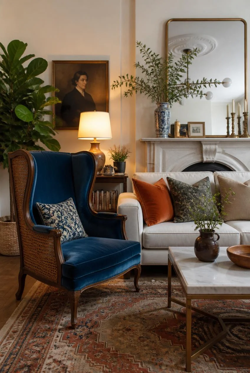
A single vintage or antique piece, such as a velvet wingback chair with cane detailing, can give a colorful living room a sense of history that new furniture alone cannot provide. It does not need to match the rest of the room, and in many cases, it works better when it does not.
This kind of piece adds visual interest through age and texture rather than through color alone, which helps balance a room that might otherwise feel too uniformly new or polished.
Why Imperfection Helps
Rooms that feel too perfectly coordinated often feel less inviting. A single piece with visible character or history gives a colorful room permission to feel lived in rather than staged.
Greenery as a Natural Color Connector
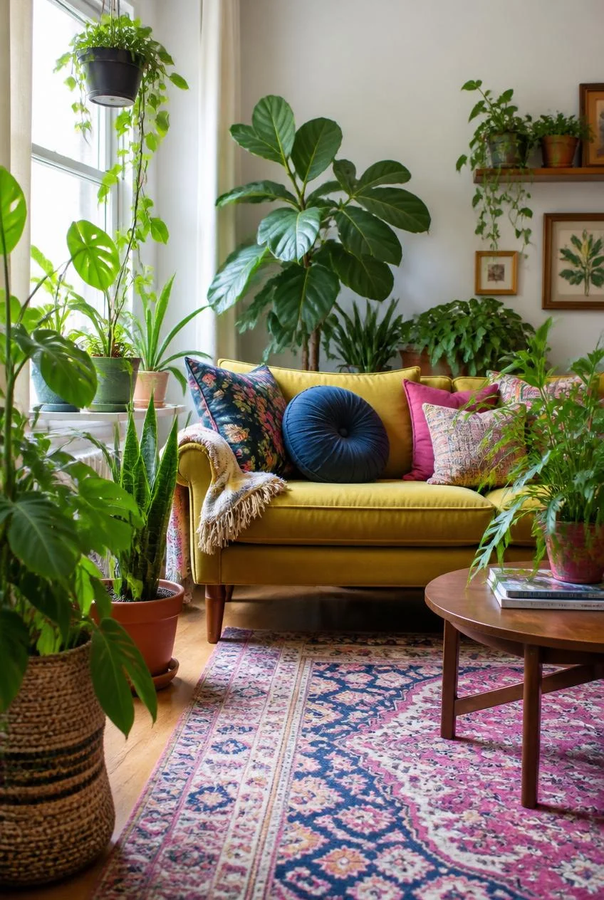
Plants are one of the simplest ways to introduce color into a living room without committing to paint, fabric, or art. Large leafy plants add deep green tones that work with almost any palette, while trailing varieties soften hard lines around windows, shelves, and furniture.
In rooms with a lot of warm tones, like rust, mustard, or terracotta, greenery provides a cooling visual break. In rooms built around cool tones like teal or blue, plants add warmth and life without disrupting the palette.
Styling Note
Vary plant heights and leaf shapes rather than choosing matching pots and identical plants. A mix feels collected over time, while matching sets can feel more like a display than a living space.
Committing to One Bold Piece First
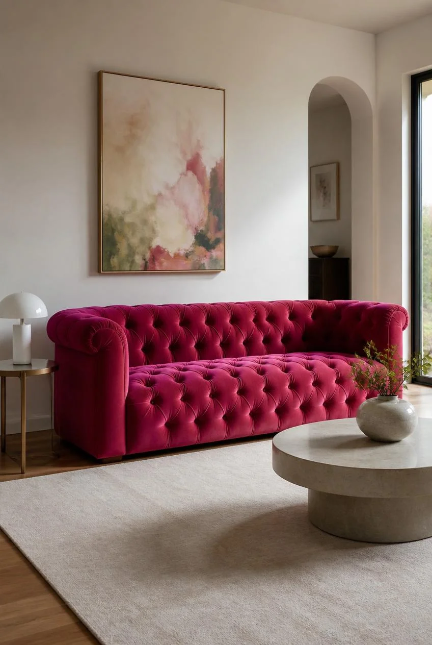
Every genuinely colorful living room starts somewhere, and it is rarely with a fully finished plan. Sometimes it is a sofa color that felt too bold at first. Sometimes it is a rug that someone could not walk past in a store. The color comes first, and the rest of the room follows from there.
This approach removes the pressure of getting everything right before starting. Once one bold piece is in place, it becomes much easier to choose everything else around it, because that piece sets the tone, the temperature, and often the overall mood of the space.
Getting Started
If you are unsure where to begin, choose the piece you are most drawn to, even if it feels slightly outside your comfort zone. The rest of the room will follow more naturally than you expect.
Bringing It All Together
Color in a living room is far more forgiving than most people assume, as long as a few basic principles guide the process. Ground bold choices with texture, give the eye somewhere to rest, keep saturation levels relatively consistent across pieces, and remember that brightness and boldness are not always the same thing.
None of the ideas above require a full renovation or an unlimited budget. A painted ceiling section, a single statement sofa, a gallery wall with varied frames, or even a well chosen rug can shift an entire room. The goal is not to copy a specific look exactly, but to recognize the decisions that make these spaces feel resolved, and apply that thinking to your own home.
Start with one piece you genuinely love, build outward from there, and let the room develop its own personality over time. The most memorable living rooms are rarely the ones that followed every rule. They are the ones where someone simply committed to a color and meant it.
Frequently Asked Questions
What is the easiest way to start adding color to a neutral living room?
Start with one statement piece, such as a colorful sofa, rug, or accent chair, and build the rest of the room’s palette around that single item.
Do colorful living rooms work in small spaces?
Yes. In smaller rooms, a single bold wall or ceiling, combined with lighter furniture, can create impact without overwhelming the space.
How many colors should a colorful living room include?
Most successful colorful rooms work with two or three main colors plus one or two accent tones, rather than an unlimited mix.
Will bold colors make a room feel outdated quickly?
Earthy and jewel toned colors such as rust, teal, mustard, and deep green tend to age well and stay relevant much longer than trend driven bright colors.
How does lighting affect colorful living rooms?
Warm lighting deepens reds and oranges and softens cool tones like blue and teal, which means a room can look noticeably different in the evening compared to daytime.
You May Also Like This Post:
13 Elegant Dining Room Ideas That Look Expensive and Timeless

One Comment