16 Kitchen Cabinet Color Ideas for a Modern, Stylish and Timeless Look
The Color Decision That Defines Your Kitchen
There is a moment during every kitchen renovation when paint samples cover the countertops, cabinet door prototypes lean against walls, and the weight of this single decision becomes crystal clear: the cabinet color you choose will define your kitchen’s entire character for the next decade or longer. Unlike throw pillows or wall art that change with seasons, cabinets represent a significant investment and commitment that anchors every other design choice in the space.
Kitchen cabinet color ideas have evolved dramatically beyond the basic choice between oak and white that dominated previous generations. Today’s homeowners navigate a spectrum from soft whisper neutrals to dramatic dark hues, nature-inspired greens to sophisticated grays, each color carrying distinct psychological effects, design implications, and long-term value considerations. The proliferation of choices creates both exciting possibilities and genuine decision paralysis.
The perfect cabinet paint color achieves something remarkable: it reflects your personal aesthetic while maintaining timeless appeal that enhances resale value, complements both your existing home architecture and desired kitchen style, coordinates seamlessly with countertops and backsplash selections, and creates the specific mood you want your kitchen to evoke. Whether you seek the energizing brightness of classic white cabinets, the grounding warmth of natural wood tones, the sophisticated depth of navy, or the fresh serenity of sage green, the right color transforms your kitchen from merely functional to genuinely inspirational.
This comprehensive guide presents 16 proven kitchen cabinet color ideas spanning the spectrum from tried-and-true classics to exciting contemporary options. Each color includes specific shade recommendations, styling guidance, hardware pairings, and insights into which design styles and personal preferences each option serves best. Whether planning a complete kitchen makeover or simply refreshing tired cabinets with paint, these ideas will help you make the confident color choice your kitchen deserves.
Classic White for Timeless Elegance and Brightness
Classic white remains the most popular kitchen cabinet choice for compelling reasons that transcend mere trend-following. White cabinets create the perception of larger, brighter spaces through their light-reflective properties, making them particularly valuable in smaller kitchens or those with limited natural light. The crisp, clean appearance signals freshness and sophistication while providing a versatile backdrop that works with virtually any countertop material, backsplash pattern, or hardware finish.
The key to successful white cabinets lies in selecting the right undertone for your specific space. Pure bright whites like Benjamin Moore’s Simply White or Sherwin-Williams’ Pure White deliver maximum brightness and modern crispness, ideal for contemporary or minimalist aesthetics. Warm whites with beige or cream undertones like Cloud White or Swiss Coffee create softer, more inviting atmospheres perfect for transitional or traditional kitchens. Cool whites with gray undertones provide sophisticated neutrality that complements stainless steel appliances and contemporary materials.
Pair white cabinets with brass hardware for warm traditional elegance, matte black fixtures for crisp modern contrast, or polished chrome for timeless sophistication. The classic white kitchen works beautifully with marble countertops for luxury appeal, butcher block for farmhouse warmth, or quartz in any color for contemporary versatility. This foundation color ensures strong resale value as it appeals to the broadest buyer demographics.
Soft Gray and Greige for Sophisticated Neutrality
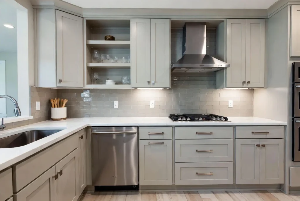
Soft gray cabinets offer refined sophistication without the potential starkness of pure white. Gray provides depth and visual interest while maintaining the neutral versatility that allows other design elements to shine. The spectrum ranges from pale silver-grays that feel almost white to deeper charcoal tones that approach dramatic dark cabinets, with most homeowners gravitating toward mid-tone grays that balance lightness with substance.
Greige, the beloved hybrid of gray and beige, delivers the best of both color families. This warm neutral feels more inviting than cool gray while offering more contemporary appeal than traditional beige. Shades like Benjamin Moore’s Revere Pewter or Sherwin-Williams’ Agreeable Gray create universally appealing backgrounds that complement both warm and cool accent colors. The adaptability makes greige particularly valuable in open-concept spaces where kitchen colors must harmonize with adjacent living areas.
These neutral tones work beautifully in both painted cabinets and as complementary wall colors when using bolder cabinet hues. Pair soft grays with white quartz countertops and subway tile for timeless appeal, or combine with warmer wood elements and aged brass fixtures for transitional warmth. The sophisticated yet approachable nature of gray and greige cabinets ensures they remain stylish through changing trends.
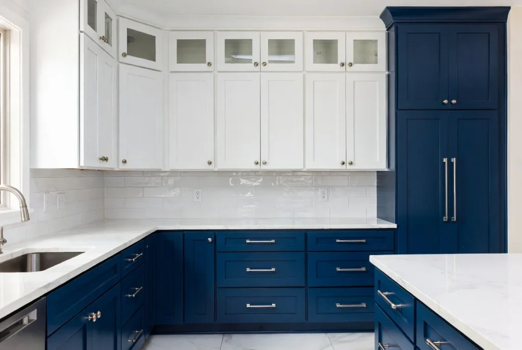
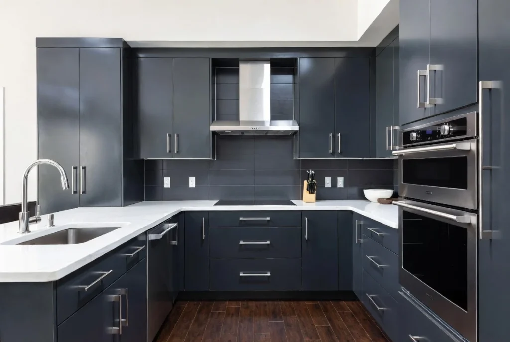
Navy Blue for Bold Sophistication and Depth
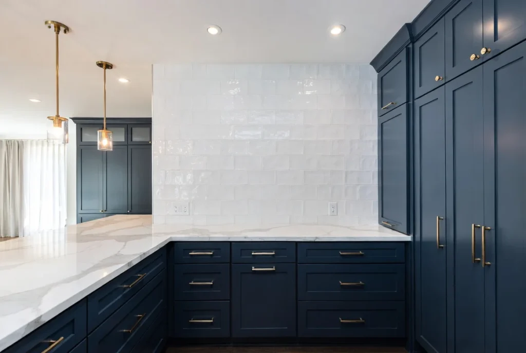
Navy blue cabinets deliver dramatic impact without the severity of black, offering rich color that feels both classic and contemporary. This deep, saturated hue adds genuine personality to kitchens while maintaining enough neutrality to avoid overwhelming spaces or limiting future design changes. Navy works particularly well on lower cabinets or kitchen islands in two-tone designs, providing grounding contrast against lighter upper cabinets or walls.
The color psychology of navy conveys confidence, stability, and sophistication. In kitchens, navy cabinets create cozy, intimate atmospheres that feel more restaurant-like than sterile, perfect for homes where the kitchen serves as a gathering hub. The dark tone hides wear and fingerprints better than lighter colors, a practical advantage for busy families.
Pair navy cabinets with white quartz countertops for crisp contrast and maximum sophistication. Brass or gold hardware adds warmth and luxury, while the combination of navy and brass has become an enduring design pairing. Consider lighter backsplash colors to prevent the space from feeling too dark, and ensure adequate lighting through both natural sources and well-planned fixtures. Popular navy shades include Hale Navy, Naval, and In The Navy, each offering slightly different undertones and intensities.
Sage Green for Fresh, Nature-Inspired Calm
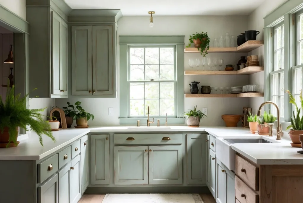
Sage green has emerged as one of the most popular cabinet color trends, offering the perfect balance between color interest and neutral versatility. This muted, grayish-green evokes nature’s calming influence without reading as overtly green, making it sophisticated enough for modern and traditional kitchens alike. Sage works beautifully in kitchens seeking organic, serene atmospheres that promote relaxation and connection to the natural world.
The color pairs exceptionally well with natural wood elements, from wood flooring to open shelving to butcher block countertops. This combination reinforces the nature-inspired aesthetic while adding warmth that prevents sage from feeling cold. White or cream countertops create fresh, bright contrast, while deeper stone materials like soapstone provide earthy sophistication.
Sage green cabinets complement both brass hardware for traditional warmth and matte black fixtures for contemporary edge. The color works particularly well in farmhouse, cottage, Scandinavian, and transitional design styles. For those hesitant about full commitment, consider sage on lower cabinets with white uppers, or use sage for a feature island while keeping perimeter cabinets neutral.
Natural Wood Tones for Warmth and Character
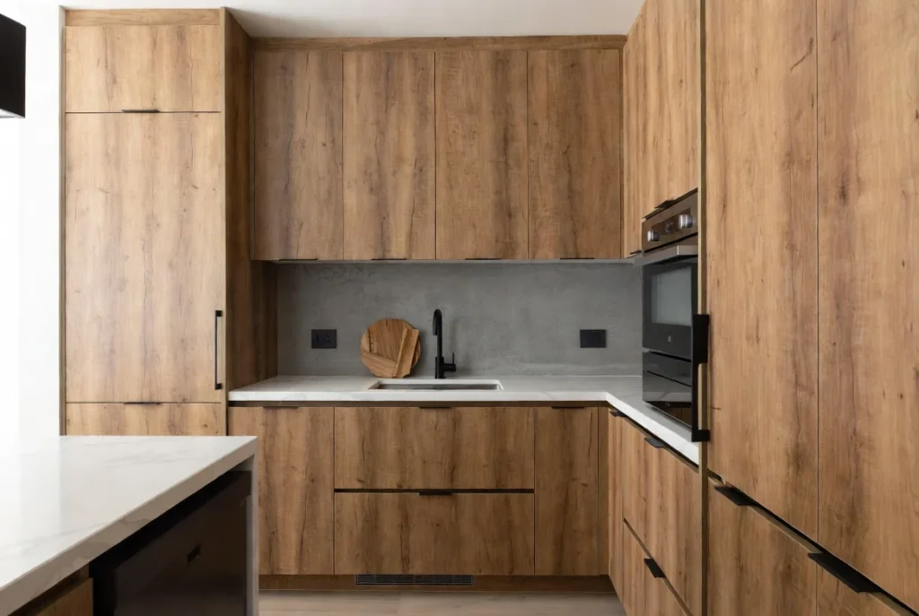
The return to natural wood cabinets represents a reaction against years of painted-everything kitchens. Wood brings irreplaceable warmth, organic texture, and visual interest that painted surfaces cannot replicate. From light honey oak to rich walnut, medium cherry to dramatic ebony, wood tones span a spectrum that accommodates every design aesthetic from rustic farmhouse to sleek contemporary.
Light woods like white oak, maple, and birch create Scandinavian-inspired brightness with natural warmth. These lighter natural wood tones work particularly well in modern and minimalist kitchens where clean lines dominate. Medium woods including cherry, hickory, and medium-stained oak deliver classic traditional appeal with rich color that adds depth without darkness. Dark woods like walnut and ebony-stained oak provide dramatic, sophisticated backdrops ideal for contemporary and transitional designs.
The grain patterns in wood add texture and visual movement that prevent spaces from feeling flat or monotonous. Each piece of wood displays unique characteristics, ensuring your cabinets possess one-of-a-kind beauty. While stained cabinets require more careful coordination with other elements than neutral painted options, the payoff comes in timeless, enduring beauty that genuinely improves with age. Pair wood cabinets with stone or concrete countertops, simple backsplashes that do not compete with wood grain, and hardware that enhances rather than overwhelms the natural material.
Black Cabinets for Dramatic Modern Impact
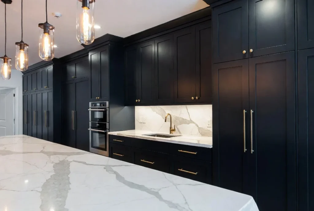
Black cabinets represent the boldest choice in kitchen design, delivering unmatched drama and contemporary sophistication. While requiring confidence and careful planning, black creates stunning, memorable kitchens that feel more like high-end restaurants than standard home cooking spaces. The key to successful black cabinets lies in balancing the dark elements with adequate light sources, reflective surfaces, and strategic use of contrasting colors.
Black works particularly well in larger kitchens with abundant natural light, where the dark cabinets add depth without creating cave-like feelings. In smaller spaces, consider black on lower cabinets or islands only, keeping upper cabinets lighter to maintain visual airiness. Matte finish black feels ultra-modern and hides fingerprints better than glossy, while high-gloss black creates sleek, reflective luxury at the cost of showing every smudge.
Pair black cabinets with white or light-colored countertops for maximum contrast and visual pop. Marble, white quartz, and light granite all provide beautiful counterpoints to dark cabinets. Brass or gold hardware adds warmth and prevents the black-and-white scheme from feeling too stark, while matte black fixtures create seamless, monochromatic sophistication. Ensure excellent lighting through multiple sources including under-cabinet lights, pendant fixtures, and maximized natural light.
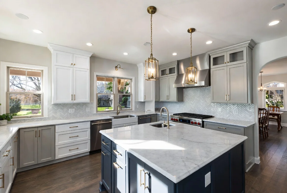
Two-Tone Cabinets for Visual Interest and Dimension
Two-tone cabinets solve multiple design challenges simultaneously while creating genuinely custom-looking kitchens. This approach typically features darker lower cabinets paired with lighter upper cabinets, grounding the space while maintaining visual lightness. Alternatively, use a bold color on the kitchen island while keeping perimeter cabinets neutral, creating a focal point that adds personality without overwhelming the entire room.
Popular two-tone combinations include white uppers with navy lowers, creating crisp, nautical-inspired contrast. Sage green islands with white perimeter cabinets deliver fresh, contemporary appeal with nature-inspired warmth. Black lower cabinets with warm wood uppers create striking modern-traditional fusion. Greige bases topped with white uppers offer subtle sophistication through tonal variation.
When planning two-tone cabinets, ensure the colors share similar undertones or complementary color temperatures to create cohesive harmony rather than jarring contrast. The division point typically occurs at counter height, creating logical visual separation. This approach allows you to incorporate bolder colors in limited doses, adding personality while maintaining broad appeal for future resale value.
Warm Beige and Tan for Cozy Traditional Appeal
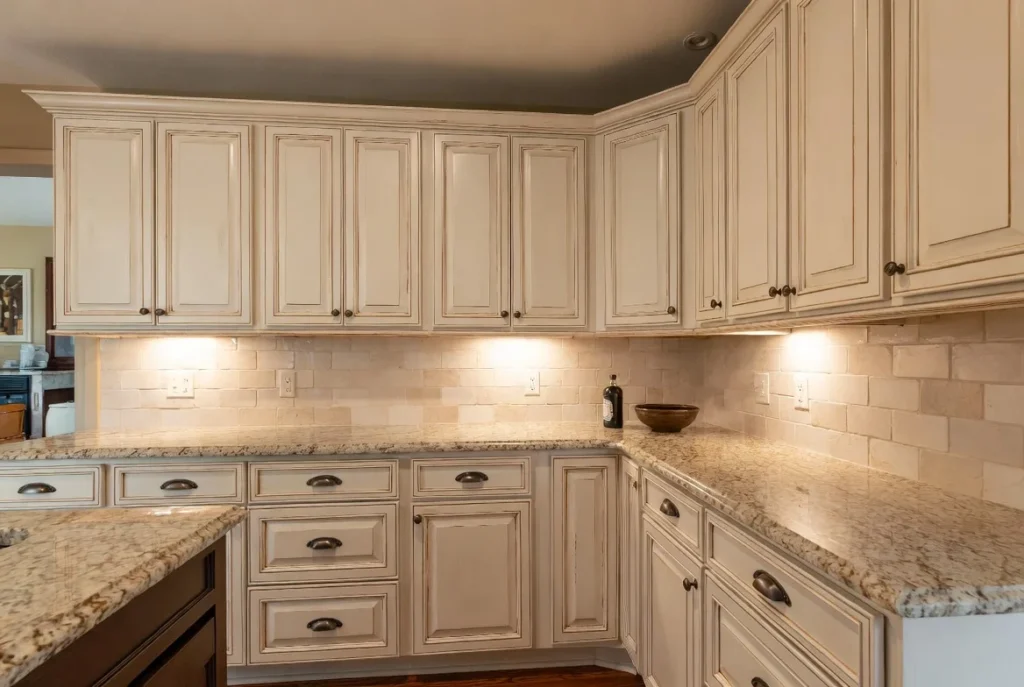
Warm beige and tan cabinets create inviting, comfortable kitchens that feel lived-in from day one. These warm neutrals work particularly well in traditional and transitional design styles, complementing both classic architectural details and more contemporary elements. Unlike stark white or cool gray, warm neutrals bring immediate coziness that makes kitchens feel like genuine gathering spaces.
Shades range from pale cream through medium tan to deeper taupe, each offering different levels of warmth and visual weight. Lighter beiges approach off-white in their brightness while adding just enough color to prevent sterility. Medium tans deliver obvious warmth without reading as brown. Deeper taupes provide substantial color presence while maintaining neutral versatility.
Pair warm beige cabinets with granite countertops featuring warm brown and gold tones for cohesive traditional elegance. Cream or beige subway tile backsplashes reinforce the warm palette, while touches of deeper brown through wood flooring or furniture add depth. Bronze or brass hardware enhances the warm traditional aesthetic, though brushed nickel works for those seeking slightly more contemporary appeal.
Deep Forest Green for Rich, Organic Luxury
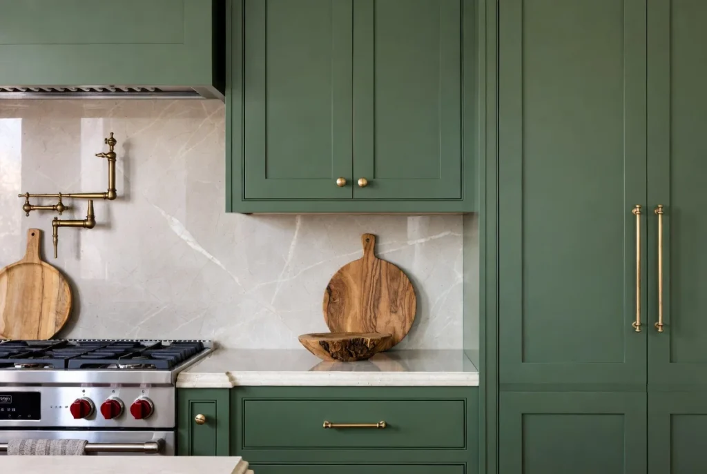
Forest green cabinets bring the depth of navy with an organic, nature-inspired twist. These rich, saturated greens feel both timeless and on-trend, offering genuine personality without the potential limitations of more unusual color choices. Forest green works beautifully in both traditional and contemporary kitchens, adapting to different styles through strategic pairing with appropriate materials and hardware.
The color’s association with nature creates inherently calming, grounding atmospheres while the depth provides sophistication and visual weight. Forest green hides wear particularly well, making it practical for busy kitchens. The color coordinates beautifully with natural wood elements, from floors to open shelving to wooden countertops, reinforcing the organic aesthetic.
Pair forest green with marble countertops featuring green veining for luxurious coordination, or choose white marble for crisp contrast. Warm brass hardware adds traditional elegance, while matte black fixtures create more contemporary edge. Consider forest green for lower cabinets with lighter uppers if full commitment feels overwhelming, or use this rich hue on a statement island.
Soft Powder Blue for Serene Coastal Vibes
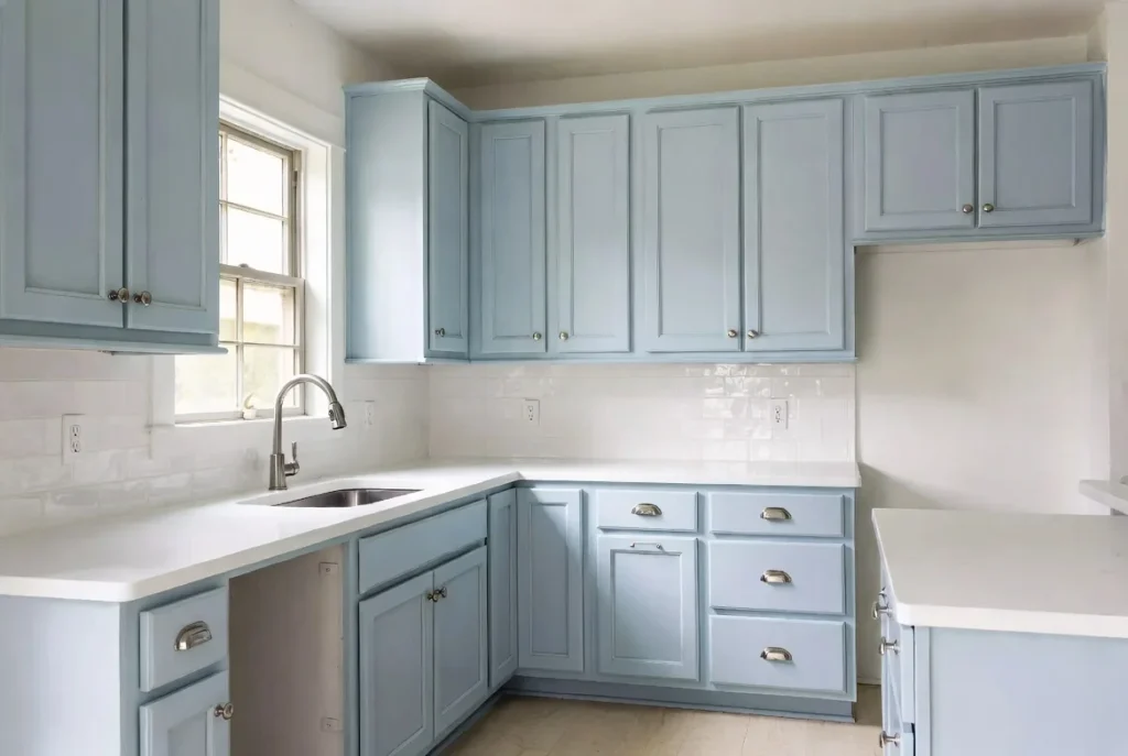
Soft blue cabinets bring the serenity of sky and sea into kitchens, creating inherently calming spaces that feel fresh and inviting. These gentle hues work particularly well in coastal, cottage, and farmhouse design styles, though thoughtful styling can adapt powder blue to more contemporary aesthetics. The color’s light-reflective properties maintain brightness while adding genuine color interest that white cannot match.
Powder blue cabinets coordinate beautifully with white countertops and subway tile for classic cottage appeal. Wood elements add warmth that prevents the blue from feeling cold, while touches of brass or copper provide complementary contrast. For more contemporary approaches, pair soft blue with concrete countertops, matte black hardware, and minimal accessories for Scandinavian-inspired simplicity.
The color’s association with tranquility makes it particularly appropriate for kitchens where calmness and peace are priorities over energetic stimulation. Soft blue works well in smaller kitchens where lighter colors maintain spaciousness while adding more personality than white provides.
Charcoal Gray for Modern Moody Sophistication
Charcoal gray occupies the sweet spot between stark black and soft gray, delivering substantial color presence without black’s potential severity. This deep neutral creates moody, sophisticated kitchens that feel contemporary and luxurious. Charcoal works particularly well in modern and contemporary design styles where clean lines and dramatic impact take precedence over traditional warmth.
The color provides excellent contrast against white or light countertops while maintaining more versatility than true black. Charcoal coordinates well with stainless steel appliances, creating cohesive modern kitchens. The dark tone effectively hides wear and minor imperfections, making it practical for real-world use despite its refined appearance.
Pair charcoal cabinets with white quartz or marble countertops for maximum contrast and sophistication. Brushed nickel or chrome hardware reinforces the contemporary aesthetic, though warmer brass adds unexpected traditional touches. Ensure adequate lighting to prevent charcoal from feeling oppressive, including under-cabinet lights, pendant fixtures, and maximized natural sources.
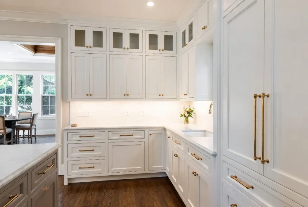
Cream and Off-White for Soft Traditional Warmth
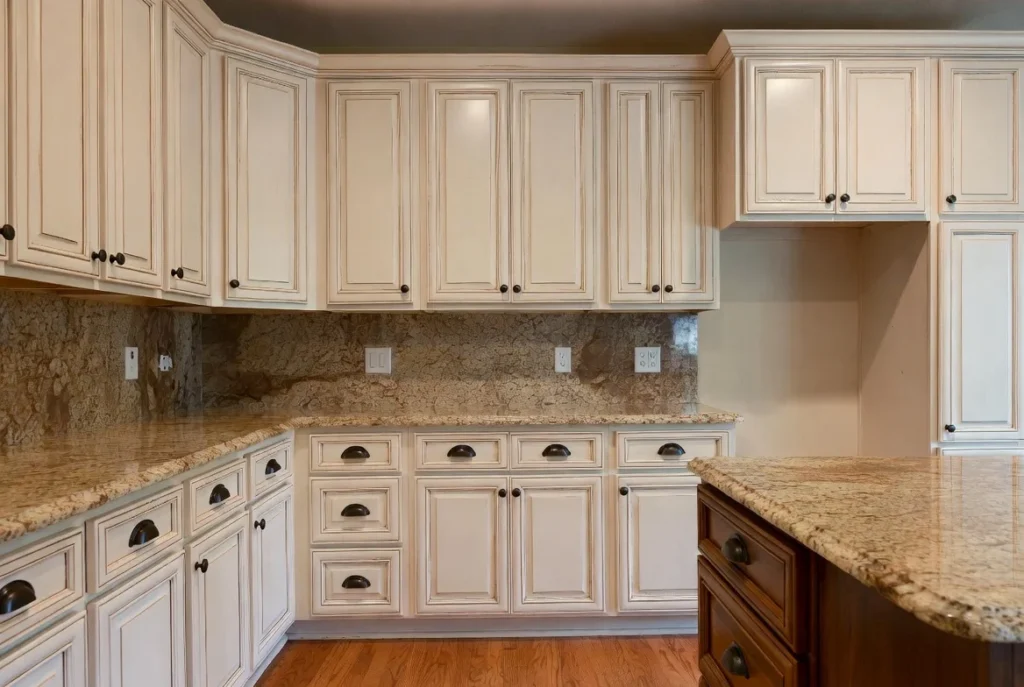
Cream and off-white cabinets occupy the middle ground between stark white and beige, offering the brightness and spaciousness of white with added warmth that prevents coldness. These soft neutrals work beautifully in traditional, farmhouse, and transitional kitchens where cozy warmth takes priority over crisp contemporary brightness. The subtle color provides enough visual interest to prevent blandness while maintaining the versatility and broad appeal of near-neutrals.
Cream cabinets coordinate effortlessly with warm wood flooring, granite countertops featuring brown and gold tones, and traditional backsplash materials like beige subway tile or travertine. The warm undertones create harmonious palettes that feel cohesive and intentional rather than mismatched. This color choice delivers timeless appeal with universal likability, making it excellent for resale considerations.
Pair cream cabinets with oil-rubbed bronze or antique brass hardware for traditional elegance, or choose brushed gold for more contemporary glamour. The soft neutral background allows countertops, backsplash, and accessories to shine without competing with overly colorful cabinets.
Terracotta and Warm Brown for Earthy Modern Appeal
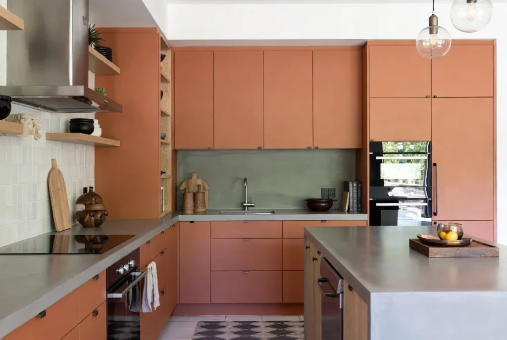
Terracotta and warm brown cabinets represent the cutting edge of cabinet color trends, bringing earthy, organic warmth to contemporary kitchens. These rich, saturated hues feel both bold and approachable, adding genuine personality without the severity of black or the coolness of many trendy colors. The warm tones create inherently inviting spaces that balance contemporary style with timeless comfort.
These colors work particularly well when combined with natural materials like wood, stone, and concrete. Terracotta cabinets pair beautifully with white oak flooring, concrete countertops, and minimal backsplashes that allow the cabinet color to dominate. Warm browns coordinate with virtually any wood tone while adding color interest beyond standard wood staining.
The color psychology of warm earth tones promotes comfort, stability, and connection to nature. In kitchens, these feelings translate to spaces where people want to linger, cook, and gather. Pair these warm cabinets with brass or bronze hardware for cohesive warmth, or choose matte black for contemporary contrast. While currently trending, the fundamental appeal of warm earth tones suggests staying power beyond momentary fashion.
Blush Pink and Soft Pastels for Playful Contemporary Style
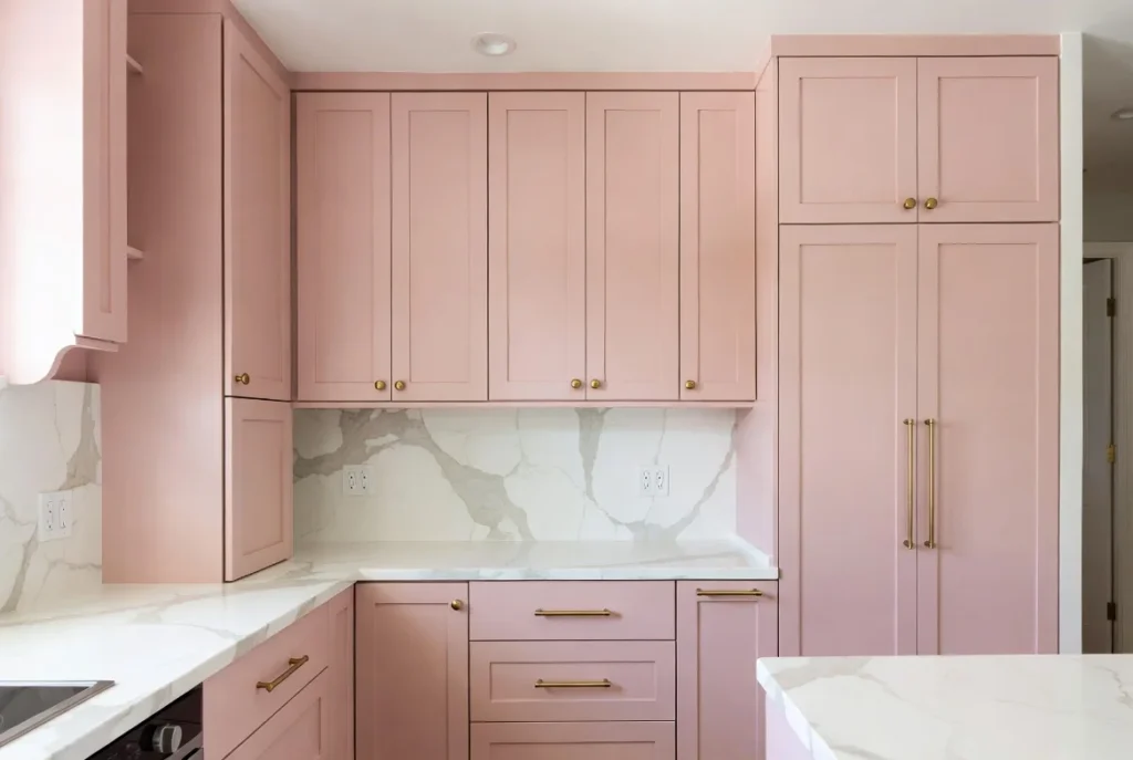
Blush pink and other soft pastels bring unexpected personality to kitchens while maintaining enough subtlety to avoid overwhelming spaces or limiting future design changes. These gentle hues work particularly well in contemporary, eclectic, and feminine design aesthetics, offering alternatives to standard neutrals without the commitment level of bolder saturated colors.
Pale pink cabinets create romantic, sophisticated kitchens when paired with marble countertops, brass hardware, and minimal accessories. The color feels fresh and modern rather than overtly traditional or childish when executed in matte finishes with contemporary styling. Other soft pastels like mint green, pale yellow, and lavender offer similar benefits with different psychological associations and styling possibilities.
These colors work best in well-lit kitchens where the soft hues maintain visibility without washing out. Pair with white or very light countertops to prevent the space from feeling too colorful, and keep backsplash and walls neutral to let the cabinet color shine. Pastel cabinets deliver maximum impact on islands or lower cabinets with white uppers maintaining overall brightness.
Deep Burgundy and Wine for Luxurious Drama
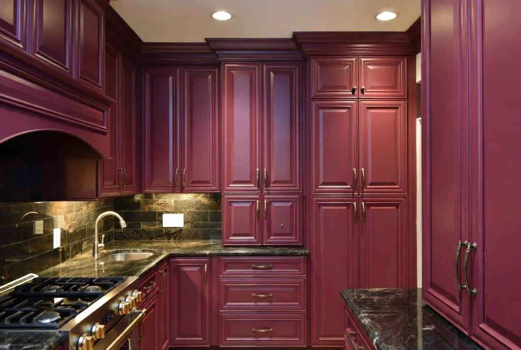
Deep burgundy and wine tones bring the sophistication of navy with warmer, more unusual character. These rich, saturated reds create genuinely unique kitchens that make strong style statements while maintaining enough depth to feel sophisticated rather than garish. The color works particularly well in traditional and eclectic design styles, though contemporary spaces can incorporate deep reds through careful styling.
Burgundy cabinets coordinate beautifully with dark granite or marble countertops featuring red, brown, and gold veining. The monochromatic palette creates cohesive luxury that feels intentional and refined. White or cream countertops provide crisp contrast that lightens the overall effect while allowing the cabinet color to dominate.
Pair deep red cabinets with bronze or brass hardware for traditional warmth, or choose matte black for more contemporary edge. Ensure excellent lighting to prevent the dark, saturated color from making spaces feel oppressive. Consider burgundy for lower cabinets or islands only if full commitment feels too bold, creating dramatic focal points within predominantly neutral kitchens.
Olive Green for Versatile Sophisticated Style
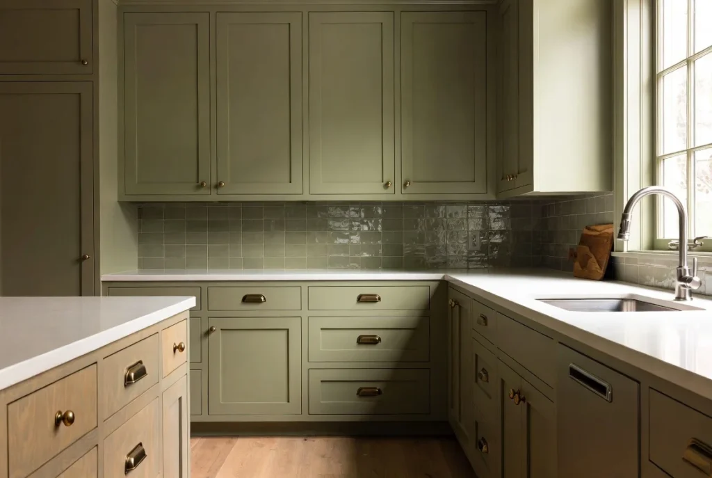
Olive green occupies interesting middle ground between sage’s softness and forest green’s depth, offering versatile sophistication that works across multiple design styles. This muted, earthy green feels both timeless and contemporary, adding genuine color while maintaining enough neutrality to coordinate with various materials and palettes. Olive green cabinets create calm, grounded kitchens with nature-inspired character.
The color pairs exceptionally well with natural wood, from light oak to deep walnut, creating cohesive organic palettes. White or cream countertops provide fresh contrast, while deeper stone materials enhance the earthy aesthetic. Olive coordinates with both warm and cool accent colors, making it remarkably versatile for future design changes.
Pair olive green cabinets with aged brass or bronze hardware for vintage-inspired warmth, or choose brushed gold for contemporary glamour. The color works beautifully in both traditional and modern kitchens, adapting through appropriate styling with complementary materials and finishes.
Choosing the Right Finish for Your Cabinet Color
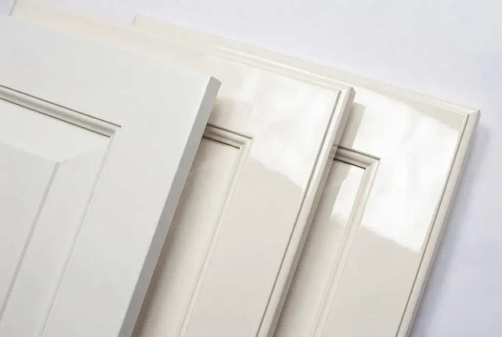
The finish you select for your cabinets dramatically affects the final appearance and practical performance of your chosen color. Matte finishes create contemporary, sophisticated looks that hide fingerprints and minor imperfections better than glossy alternatives. The lack of shine provides subtle, understated elegance particularly appropriate for modern and transitional designs. Matte works beautifully on both light and dark colors, though it excels at making dark cabinets feel less heavy.
Satin or semi-gloss finishes offer gentle sheen that enhances color while providing easier cleaning than matte. The subtle reflectivity adds dimension and light reflection without the high-maintenance nature of full gloss. This finish represents the middle ground suitable for most kitchen applications, particularly in traditional and transitional styles.
High-gloss finishes create dramatic, luxurious effects through maximum light reflection. The mirror-like surface makes colors appear more saturated and vibrant while creating modern, fashion-forward aesthetics. However, gloss shows every fingerprint, smudge, and imperfection, requiring frequent cleaning to maintain appearance. Gloss works best in contemporary or glamorous design styles where maintenance effort is worthwhile for desired aesthetic impact.
Conclusion: Your Perfect Kitchen Cabinet Color Awaits
Selecting kitchen cabinet colors represents one of the most impactful design decisions you will make during renovation or new construction. The right color transforms your kitchen from merely functional to genuinely inspirational, creating the specific mood and aesthetic you want while coordinating seamlessly with countertops, backsplash, flooring, and hardware. Whether drawn to the timeless appeal of classic white, the sophisticated depth of navy, the nature-inspired calm of sage, or the dramatic impact of black, the perfect color exists for your unique combination of personal style, practical needs, and design goals.
The 16 kitchen cabinet color ideas presented throughout this guide span the complete spectrum from soft neutrals through bold saturated hues, traditional classics through contemporary trends. Remember that no single “best” color exists; instead, the ideal choice depends on your kitchen’s size and light, your home’s architectural style, your personal color preferences, your commitment to trends versus timelessness, and your future plans for the home including potential resale considerations.
Begin your color selection journey by gathering inspiration images that resonate with your aesthetic, obtaining actual paint samples to view in your specific lighting conditions, considering how colors coordinate with existing or planned countertops and flooring, and thinking honestly about your long-term commitment to bolder choices versus safer neutrals. The investment you make in thoughtful color selection pays dividends daily through increased enjoyment of your kitchen and long-term value preservation for your home.
Your kitchen deserves colors that make you smile every time you enter the space, that create the perfect backdrop for both everyday family meals and special celebrations, and that endure through years of use while maintaining beauty and relevance. Choose with confidence, knowing these proven cabinet colors deliver the modern, stylish, and timeless results you seek.
Frequently Asked Questions
What is the most timeless kitchen cabinet color?
Classic white remains the most universally timeless kitchen cabinet color, maintaining popularity across decades and design trends. White cabinets appeal to the broadest range of buyers, work with virtually any style from traditional to contemporary, and create bright, spacious-feeling kitchens. For those seeking timelessness beyond white, soft gray, greige, and natural wood tones all demonstrate enduring appeal. These colors avoid trendy extremes while providing more personality than pure white, ensuring they remain stylish through changing fashions.
Should I choose the same color for upper and lower cabinets?
Matching upper and lower cabinets creates cohesive, classic looks that maximize the chosen color’s impact while simplifying design decisions. However, two-tone cabinets offer distinct advantages including added visual interest and dimension, opportunities to incorporate bolder colors in limited doses, and grounding effects from darker lower cabinets paired with lighter uppers. The best choice depends on your kitchen size, ceiling height, and desired aesthetic impact. Smaller kitchens often benefit from consistent color maintaining spaciousness, while larger kitchens can support two-tone complexity.
How do I choose cabinet colors for small kitchens?
Small kitchens benefit most from lighter cabinet colors that reflect light and create spacious feelings. Classic white, soft cream, pale gray, and light sage all work beautifully in compact spaces. If you want darker colors, consider using them only on lower cabinets or islands while keeping upper cabinets light to prevent oppressive feelings. Ensure excellent lighting through multiple sources, use glass-front upper cabinets to create visual openness, and choose simple hardware that does not add visual clutter. The goal is maximizing perceived space while incorporating colors you love.
What cabinet colors work best for resale value?
Neutral colors deliver the strongest resale value by appealing to the broadest buyer demographics. Classic white, soft gray, greige, and natural wood tones all represent safe choices that do not limit buyer interest. Navy blue has become mainstream enough to offer strong resale appeal while providing more personality than pure neutrals. Avoid highly saturated colors, unusual hues like purple or orange, and very dark colors in small kitchens. If you love bold colors, consider incorporating them on islands only, allowing new owners to easily change that element while keeping neutral perimeter cabinets.
Can I paint existing cabinets or do I need to replace them?
Quality existing cabinets in good structural condition can absolutely be painted rather than replaced, delivering dramatic transformations at a fraction of replacement costs. The process requires proper preparation including thorough cleaning, sanding, priming, and using high-quality cabinet paint designed for durability. Professional painters typically charge significantly less than cabinet replacement while achieving excellent results that last years. However, cabinets with structural damage, outdated styles with decorative elements you dislike, or extremely low-quality construction may warrant replacement. Painting works best on flat or simple door styles, while heavily detailed doors can be more challenging to paint smoothly.
You May Also Like This Post:
15 Backyard Privacy Wall Ideas to Block Neighbors and Create a Cozy Space
One Comment